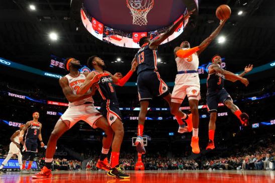
What people said about the Los Angeles Clippers‘ plan to change their name on February 26 was not all positive. There are people who like the Clippers’ unique approach, with a stronger focus on a nautical theme, and people like me who think the name looks like it belongs to a ship company.
I like how their creative team thought outside the box to come up with something we’ve never seen from a professional sports team before. Maybe I’ll grow to like it. It would be great if the font on the shirts went back to script.
The Clippers recently changed their logo, outfits, and color scheme, which made me think of other teams in the league that really need to refresh their look. This is by no means a complete list, because I honestly think most of the NBA’s jerseys and logos are pretty forgettable.
However, these are the top 5 teams that should get rid of their current outfits and, in some cases, logos and start over.
Revamping NBA Style

1. Dallas Mavericks
Choosing the top of this list was easy. Two of the Mavericks’ four jerseys are from 2010-11. Nostalgia surrounds the Association and Icon jerseys from Dirk Nowtizki’s tenure, which featured the franchise’s sole title, but it’s time to retire them. The Statement edition jersey appears more like a Summer League uniform than an NBA team’s nightly uniform.
Dallas needs a new jersey and logo, and it should have been done when Nowitzki retired and Luka Doncic took over. Dallas has simply made minor cosmetic alterations to its two primary jerseys, changing the logo patch and blue color. If anything, this year’s City Edition shirt might inspire a redesign.
The typeface is interesting, the black and blue contrast is enticing, and it might work if the jersey foundation was Dallas’ blue and white. In addition to winning a championship and trying to keep Doncic happy and in Dallas, a new majority owner may want to replace these boring jerseys with something new.
2. Detroit Pistons
The Association and Icon shirts for the Pistons have been used since the 2004 title season. They are not as nice to look at as the teal jersey with the burning horse and exhaust pipes. The present four shirts don’t show the city, and the logo isn’t very fancy.
The 2022–23 St. Cecilia green outfits are the best. They are different from the usual red, white, and blue color scheme and honor an important part of Detroit basketball past.
3. Oklahoma City Thunder
The Thunder’s color scheme is cool, but Phoenix does a better job with orange. The bright orange and navy blue watermarks on the City Edition shirt make it stand out. It would be better if the white Association shirt had some color on it.
The Thunder are an exciting young team that has a chance to win the title. OKC should use more orange and darker blues instead of light blue. They should also come up with new ideas. That would be cool to use “OKC” or “Thunder” instead of the city’s full government name.
4. Washington Wizards
There should be no “USA” in the name of the “Wizards” team. Instead, they should be called something like the Nationals or the Capitals in Major League Baseball or the National Hockey League. The cherry blossom shirts were artistic, but the whole uniform base isn’t very different from other ones. A brand refresh might be in order if the Wizards move to Virginia, but the current product on the court is not good enough to hide the team’s flaws.
5. Utah Jazz
It was only two years ago that the Utah Jazz got new uniforms with a color scheme of bright yellow, black, and white. This season, the Jazz are one of only five teams with five shirts. The fifth is a “Classic Edition” with purple outfits from the John Stockton and Karl Malone eras. The Jazz should wear the purple Mountain Range jerseys again because they are some of the best in the game.


Comments are closed.